FRAGMENT

Project Overview
Desktronic is an ergonomic office-furniture brand — height-adjustable desks, ergonomic chairs and a full accessory ecosystem — trusted by over a million customers across ten markets. Its products carry the certifications and testing of a premium brand (TÜV Rheinland, IGR, BIFMA, a 30,000-cycle column test, up to a 15-year warranty) at prices customers keep calling too good to be true.
But a standing desk is a hard thing to buy online. It's a high-consideration, spec-heavy purchase: which model, which size, one motor or two, what load, what height for my body, will it fit my room, and is it actually worth the price. Every one of those doubts is a place a buyer leaves to "research later."
The objective: design a buying experience that answers each of those doubts on the page — a legible product ladder, a visual configurator across 300+ finishes, a desk-height calculator, an evidence-led comparison, and a proof system that makes quality visible — then make it work coherently across ten country stores, multiple languages and currencies. In short: make desk-buying effortless.
A unified system across four ranges — Titanex, Bestow, Fusão and Velo
UX Research & Persona Mapping
Information Architecture
UI/UX Design
Shopify Development
CRO & Funnel Optimisation
Shop-the-Look
Desk-Height Calculator & Decision Tools
Product Configurator (size · colour · finish)
CMS Integration
Increase in conversion rate
We replaced the advisor a customer gets in a showroom with the tools they never get online — a desk-height calculator, a visual configurator and a side-by-side comparison. Desk-buying stopped being a research project and started feeling like a decision.

A High-Consideration Purchase, Low Guidance
Buyers faced a wall of choices — three desk models, six sizes, single- vs dual-motor, load ratings, height ranges — with no way to self-navigate to the one that was theirs. Complexity became hesitation.
A Catalogue, Not a Workspace
Desk, frame, chair and accessories lived as separate SKUs. The buyer thinking "whole setup" had to assemble it themselves — so most bought one item and left, and order value stayed flat.
Premium Quality, Invisible
TÜV Rheinland, IGR and BIFMA certifications, a 30,000-cycle test, a 15-year warranty — the strongest reasons to pay more were buried, so the brand risked competing on price alone.
Fragmented Multi-Market Experience
Ten country stores, multiple languages, currencies and shipping rules. Without a coherent system, buyers hit the wrong store, the wrong currency, or a "we don't ship here" wall — and bounced.
Weak Differentiation vs Cheaper Rivals
Against a generic single-motor desk, Desktronic simply read as "more expensive." The evidence that it's better existed — it just wasn't where the decision was being made.
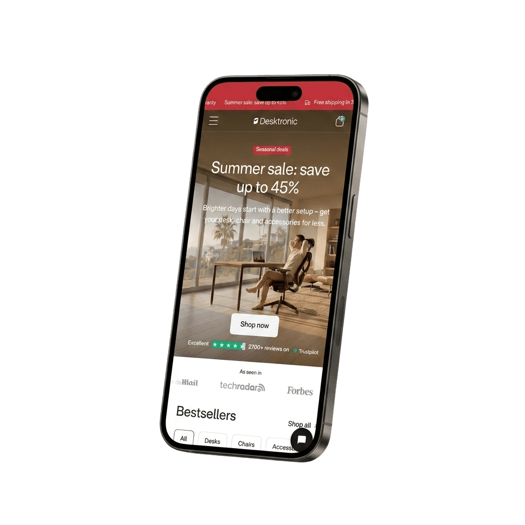
Which desk is right for me?
HomeOne, HomePro or HomeMax — different sizes, motors and loads, with no guided way to choose.
Will it be the right height for my body?
No way to know the correct desk and monitor height for their height.
Will it fit — and match — my room?
300+ finishes, but no way to picture the desk in their actual space.
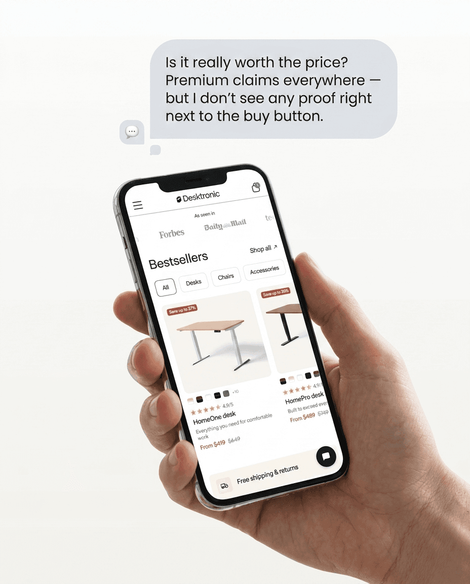
Is it really worth the price?
Premium claims without visible proof next to the buy button.
Is it sturdy, quiet and built to last?
The quiet doubts — wobble, noise, longevity — that stall every desk purchase.
Do you even ship to me?
Ten markets and unclear shipping created wrong-store, wrong-currency friction.
Project timeline - 8 Week
1.
STRATEGY
Goals & approach + Roadmap + Multi-market architecture + Conversion opportunities
2.
RESEARCH
Pain points + Insights + User personas (by buyer type) + Category & competitor analysis + Buying-journey mapping
3.
IDEATE
Information architecture + User flows + Configurator & calculator logic + Low-fi wireframes + Comparison & proof framework + Mood boards
4.
DESIGN
High-fidelity UI + Design system + Product-ladder visual language + Clickable prototypes + Configurator + Decision tools + Localisation system
Extensive research was conducted to understand how people actually buy a desk — the specs that confuse them, the doubts that stall them, and the very different reasons a WFH professional, a health-conscious sitter, a setup-obsessed creator and a B2B office buyer each reach for "add to cart." Because the same catalogue has to serve a first-time home buyer and a facilities manager kitting out a floor — across ten markets — the research had to map multiple journeys and design a system where each finds a clear, confident path.

USER PERSONA
We identified six distinct personas across the catalogue — so the experience could guide each buyer to the right product for the right reason, rather than averaging them into one.






Reorganised the store around how people decide — by need and use-case — so every buyer reaches the right product, understands why it's worth it, and can build a complete setup without friction.
1.
Guided by Need, Not by SKU
Category and use-case navigation, with a legible product ladder (One → Pro → Max), so buyers self-select instead of decoding a catalogue.
2.
Build a Workspace, Not Buy a Desk
Desk, frame, chair and accessories presented as one system — "shop the look" and bundling — so a setup is one decision, not four.
3.
Proof Before Price
Certifications, 30,000-cycle testing, warranty and a million customers surfaced early — so value is understood before the price is seen.
4.
One Brand, Every Market
A coherent localisation system across ten stores — right store, language, currency and shipping — so the experience feels local everywhere.

User Journey
Mapped the end-to-end journey to remove the doubts that stall a high-consideration purchase and create a confident path from arrival to checkout.
Discover
uide each buyer to the right model for their need and space.
Understand
Make the ergonomics, quality and proof legible before the price.
Configure
Fit the desk to their body (height) and their room (finish), and build the full setup.
Purchase
A frictionless, market-aware, proof-backed checkout with risk-free returns.
Each screen is annotated to the element doing the work — and read through the two lenses a product designer has to hold at once: the user's doubt it removes, and the business outcome it's built to drive. This single template carries all four ranges.

Make "which desk" a decision, not a research project.
PROBLEM
A first-time buyer landed on a wall of SKUs — One, Pro, Max, six sizes, two motor systems — with no way to know which was theirs. High-intent traffic stalled at "I'll research this later," and later rarely came.
SOLUTION
A product ladder made legible: each desk framed by who it's for and what it's built to do, use-case-led navigation, and the specs that matter surfaced at the decision point. The buyer recognises their desk instead of decoding a catalogue.
Let people fit the desk to their body.
PROBLEM
"Will this be the right height for me?" is the quiet doubt behind every standing-desk purchase — and there was no answer on the page
SOLUTION
A desk-height calculator that takes out the guesswork: enter your height, get your ideal desk and monitor height. A spec becomes personal, and a doubt becomes a reason to buy.


Sell the workspace, not the desk.
PROBLEM
Desk, frame, chair and accessories lived as separate listings. The buyer with the biggest basket in mind had to assemble it themselves — so most bought one item and left.'
SOLUTION
"Shop the look" setups and bundling turn four products into one workspace decision — raising order value and doing the styling for the customer.
Let people fit the desk to their room.
PROBLEM
300+ colour and finish combinations are a superpower — but buried in a dropdown, they're just noise, and the design-led buyer couldn't picture the desk in their space.
SOLUTION
A configurator that makes finish and colour visual and in-context, so the buyer sees their desk in their room before they buy — turning range into confidence.'


Win the comparison on evidence.
PROBLEM
Against a cheaper single-motor desk, Desktronic looked "just more expensive." The reasons it's better — dual-motor, one-piece top, 350 lb load, 50 dB, certified — were true but invisible.
SOLUTION
A side-by-side comparison table that puts the evidence exactly where the decision happens. The value-seeker gets proof, not promises — and premium pricing earns its place.
Turn certifications into confidence.
PROBLEM
TÜV Rheinland, IGR, BIFMA, a 30,000-cycle test, a 15-year warranty — the brand's strongest trust signals were doing nothing, because no one saw them.
SOLUTION
A "Proven, not promised" proof system: certifications, testing, warranty and 1M+ customers surfaced at every doubt-point. Quality stops being a claim and becomes something the buyer can see.


One brand, every market.
PROBLEM
Ten country stores, multiple languages, currencies and shipping rules. Without a coherent system, buyers hit the wrong store, the wrong currency, or "we don't ship here" — and left.
SOLUTION
A localisation architecture that detects the market, recommends the right store, and keeps language, currency, pricing and shipping coherent — so the experience feels local everywhere.
Make the proof social.
PROBLEM
Claims of quality read as marketing. Buyers reaching the cart weren't sure real people were actually happy.
SOLUTION
Verified reviews, creator setups and "as seen in" press woven through the journey — a million customers made visible exactly where confidence is needed.


We help premium brands turn craft into conversion — research-led, honestly measured, built to scale.